Infographics for Change Transcript
Speaker 1: The senior project in itself is pretty geared toward civic engagement because it's encouraging students inherently to see themselves as agents of change. In the imagining of the theory of change they are imagining themselves as part of the solution to this problem.
Speaker 2: There is a rubric. You need to take out the package from Monday from which you were planning your info graphics.
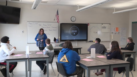
Speaker 1: This info graphic will be a smaller piece of the overall presentation in which they talk about their senior capstone work and their plans for post-graduation. The assignment today was I was trying to help students move toward a more tangible representation of that theory of change. Something like an info graphic, my hope was, that it would be bringing in digital skills but also be a visual representation that requires you to take something that is really complex and represent it with less text and in a visual way. It's something that a person could look at quickly and say, "Oh, I understand what they're trying to do here."
Speaker 2: Six out of ten LGBTQ students feel unsafe at school because of their sexual orientation. So we've got some visuals to represent those concepts; we've got some data.
Speaker 1: In today's lesson, the idea was that students would analyze my sample info graphic and grade it on the rubric to gain some familiarity with how they would be assessed and then begin the process of actually creating their own info graphic on a website.
Speaker 2: Think about the categories of the rubric. This is my example that I created. I hope that you all's are better.
Speaker 1: So for the warm-up today they looked at my info graphic in its entirety and then assessed it in each of the categories of content, organization, visuals and connection between the root cause issue and theory of change.
Speaker 2: Then theory of change ... how do we get to the root cause of an issue? If we're thinking about the root cause of homophobia and homophobic bullying then one way to address it might be to educate kids from a young age about gender. It might be to mandate parents and teachers to learn about creating safe spaces for LGBTQ kids. It might also be to ensure that LGBTQ people have full rights and change media representations. That's one idea of a theory of change. If that's my info graphic, look at your rubric, rank where you think my info graphic lands. Just curious, who on content ranked a two, developing. Why Juan?
Juan: You talked about it's in schools and then you're talking about [inaudible 00:03:02] so I don't think that's a good way in schools.
Speaker 2: So I don't make a strong enough connection maybe between the system of patriarchy and specifically-
Juan: Yes.
Speaker 2: -how homophobia looks in schools. Fair enough. What that means for you all is if that connection might be unclear for your audiences you have to be really clear so you're making very clear connections between root cause and your issue. Visuals ... [Nidia 00:03:29] what did you think about visuals?
Nidia: I said a two.
Speaker 2: A two. Why?
Nidia: You used too many different fonts and colors right there.
Speaker 2: Right. So we have a bold here. We have a non-bold here. We have a bold here and we have a different font here.
Nidia: For me, if I was reading it, I would feel like the bold is the most important one than the one in the middle.
Speaker 2: That makes absolute sense. That's something we have to be really careful about. What we're going to use is a website with a template and so it gives us some of that done already. This wasn't' the font I chose, this was the font in the template that I just decided to keep. You all can change this font. I want to give you guys a little time to start your own. I'm going to give you about seven minutes if possible to finish up your planning sheet. If you're done with your planning sheet already, then holler at me and I'll come and look and sign off and you can get a laptop and get started.
Speaker 1: I try to, just for quality control, make sure I look at every student's planning sheet and sign off on it before they get a laptop to begin to do the actual info graphic.
Speaker 2: So when you say teaching the importance of healthy relationships for theory of change, I can't remember what you said in your theory of change paper for what that would look like. Does that happen in schools? Does that happen in families?
Female: I think I said teaching kids at a young age, but I didn't specify in schools.
Speaker 1: One of the students that I checked in with first, I pushed her a little bit to reframe. How would we really think about preventing domestic violence?
Speaker 2: I think that might be key because if you're talking about doing it in shelters then that's once people have already experienced domestic violence then teaching about healthy relationships. If we're talking about addressing root cause, then we want to get at teaching healthy relationships before domestic violence occurs.
Speaker 1: This is work that does require lots of constant guidance and checking in. This is stuff that most grad school students aren't necessarily doing.
Male: This one in the [open hills 00:05:39] and income over fifty eight has an average of one supermarket per thirteen thousand residents and then [inaudible 00:05:46] there's one supermarket per ninety-three thousand residents.
Speaker 2: I think even if you just use those two facts, that would make a really strong info graphic. Maybe just think about how you would represent that visually. I'm going to continue to circulate and look at folks planning sheets to make sure that you're ready to start the actual info graphic. Once you're ready you're going to go to magic.pictochart.com
Male 2: How about Google?
Speaker 2: Once you log into pictochart there's a bunch of free templates that you can use. You should take a look and see which template is going to make the most sense for representing your information. This is the template that I used that says, "we're starting here; we're going down to here." Once I've signed off on your planning sheet then you can grab a laptop and begin to layout your info graphic. We're going to be working on this into Monday so don't worry; I know that we're just getting started today.
Speaker 1: Some of the students got to the point of beginning to work on their info graphic. Other students were still in the planning process and they'll continue that work next week. At the end of class I had students just do a pair/share checking in with each other.
Speaker 2: Turn to the person next to you and briefly explain your root cause, your issue and your theory of change.
Male 3: My root cause is basically how media portrays the usage of drugs and how society views the usage of drugs and also the whole issue of drugs being bad started when President Reagan started the war on drugs in 1971 and my root cause is how people view and my theory of change would be to educate the people about the use of drugs and the benefits and [deficits 00:07:31] of it.
Speaker 1: It's an activity that if I did it again next year I might have them do some work in groups so they would be more able to rely on each other's skills and rely on each other as resources as they do this kind of tricky thinking. I think most of our students are really clear that there is injustice in the world that feels really tangible to most of them in their lives. I think examples of resistance and liberation feel much, much less tangible. I think a lot of what we need to do as teachers in this work is to bring those examples, both from history but also from the present day. We need to lift it up where we see it and be bringing it to our students. Change agents are just people who care about things ... who do something about those things.


11 Comments
Carlo Salcedo Feb 20, 2017 10:13am
Skylar Dolezel Feb 14, 2017 9:25pm
Vonetta Wideman Jan 21, 2017 8:07pm
Brenda Stewart Jan 2, 2017 8:25pm
Young Whan Choi Dec 1, 2016 6:51pm